Wednesday, 16 June 2021

cuffs cast questions


1. Donna Prager
2.Lino Moretti
3.Jake Vickers
4. Jo Moffat
5.Ryan Drapers
6. Carl Hawkins
7. Chief super attendant Robert Vickers
8.Felix Kane
9.Misha Baig
10.Mohammed bangash
11. Benson
12. Nathan
13. Sian Quirk
14. Cinnamon/toothpaste


Monday, 7 June 2021

Q.3 How far does Cuffs adapt police drama conventions to fit its family audience at 8 p.m. on BBC1?

Cuffs is a police drama aimed at a family audience.

 Firstly Cuffs adapts to fit the family audience by its use of violence and gory imagery. Naturally a police drama such as Cuffs would involve a lot of violent imagery as the police capture their criminals or the other way round where the criminals kill or abuse another person However, Cuffs presents this imagery in a more passive and rather inoffensive way. For example when a teenager is killed in a newsagents, rather than blood being splattered across the cold floor, they instead have the  criminals splatter a curry packet to represent blood on the floor. the imagery is non violent but still gives you an idea of just how brutal these criminals are. This is done to protect the eyes of the younger viewers watching the show. Cuffs still sticks to the conventions of the police genre with fast paced moments and gripping action (such as the chase scene later in the episode)to keep the viewers hooked.

On the other hand, Cuffs also features a few light hearted and rather inoffensive jokes fit for the family audience. Similarly to the last point, typically most shows of this genre would be incredibly serious as dealing with criminals in real life is a very serious matter and is not something to laugh about. In Cuffs however we see a few jokes that present policing as somewhat as a joke. For example one of the first scenes we see Ryan looking all stern and serious. He looks like he's about to catch a serious criminal. The camera soon shows us that he is heading to a naturist beach which is the joke. rather simple but inoffensive jokes like this garner it a family audience as it is something the whole family can laugh to.

In conclusion, Cuffs adapts to the conventions of a police drama with light hearted comedy and imagery that can be viewed by the whole family just like it intends to.

Wednesday, 26 May 2021

analysis of MOJO and BBC music


  • Analyse the media language of MOJO and the BBC magazine. 
  • Make judgements and draw conclusions about how far the media language is used differently to fit different kinds of music. (15)


The MOJO magazine promotes the music genre of Rock and Roll, while BBC music is focused on more traditional music such as classical.
Firstly in the MOJO magazine the main star on the front cover is extremely close up, with only his face truly visible. Looking incredibly stern and serious reflecting on how rock was perceived in the 60's and further on, telling the audience that this music is not child's stuff. Secondly his face almost blends in with the background with the saturation being turned up on his lips, eyes and hair, this forces all eyes on him almost as if you are having direct eye contact with him and with that lifeless expression it gives the feeling of intimidation especially with the black make up that surrounds his eyes. This design and the way he looks also gives him an almost insane look to him especially when accompanied with the words "Pure Nihilism". The MOJO logo above him is bold and large almost screaming in your face and shouting the word "MOJO" to grab your attention. This also extends to the cover lines with lines such as  "Hardcore Hippies" and "It was an out-of-body experience", these words and lines suggest adventure and bravery which perfectly reflects the nature of hardcore rock artists and just how the audience will perceive them. The rock stars are also shown as youthful, in their prime. Just like how the main audience (over 35) remember them, rebellious and strong despite being much older currently.

However the BBC music magazine is very different. Firstly this issue of BBC music is very different from other issues. The majority of them feature very old musicians with quite a lot of them actually being from before the 20th century. This issue instead goes against the tide and instead has a very young star, in this case Sheku Kanneh-Mason. This does show that the BBC music magazine can be more modern and feature younger people rather than people who are older and past their prime. The word Music is in a sans serif font reflecting the music portrayed through the magazine. the mast head is thin and elegant just like the music genre itself. The colour choice too is also less saturated (unlike its MOJO counter part) along with more natural and earthy tones which help it appear more organised and simple which further helps it appeal to the older readers of the magazine. The colour choices are another feature that connects it from its genre of music.

In conclusion, both the BBC music magazine and MOJO reflect their different genres of music through different uses of media language in presentation, font and over all layout.

Tuesday, 25 May 2021

SOCIAL & CULTURAL CONTEXTS in THE OBSERVER 1960s

 Representation of women 

* Queen visits the Mourning Valley, looking very "solemn"

*Women are typically represented in ads such as the Wolsey ad.

* A darker skinned woman is shown with a white man with the quote "Jackie: we are happy"

mentions of ethnicity (or lack of it)

* A story about a mixed race couple that was deemed newsworthy 

* "Briton shoots a gold" there was a protest for black power at the Mexico Olympics.

* there was very little representation

Social conditions

*" lawyers urge divorce by consent"

* "police will appease marchers"


Wednesday, 24 March 2021

03 Pictures to use

 Most of my photos will most likely be from Thorpe park or Chessington since those two parks are very close to me and I visit more often. While somewhere like Alton towers or Blackpool are much more further away from me and I don't visit nearly as often.

Here are some of my own photos from Thorpe park and Chessington.


03 titles for dummy articles

 * Main cover line:

Airtime Addicts

For all your coaster needs

Airtime is a word commonly used by enthusiasts to describe the feeling of flying out of your seat when riding over a hill during a roller coaster.

* Main article titles

The tale of the Towers!
Discussing Alton tower's famous line up of roller coasters

The island like no other!
Discussing Thorpe park's  fantastic line up of roller coasters

Family thrills!
Discussing the UK's best family rides


Friday, 19 March 2021

possible main article brief 4 (unfinished)

 In this weeks issue of Airtime Addicts (still a draft name) we will be taking a look at quite possibly the UK's most famous and well known theme park, Alton towers, a must visit for any enthusiast in the UK. We will be looking at some of Alton tower's world famous roller coasters!

Nemesis
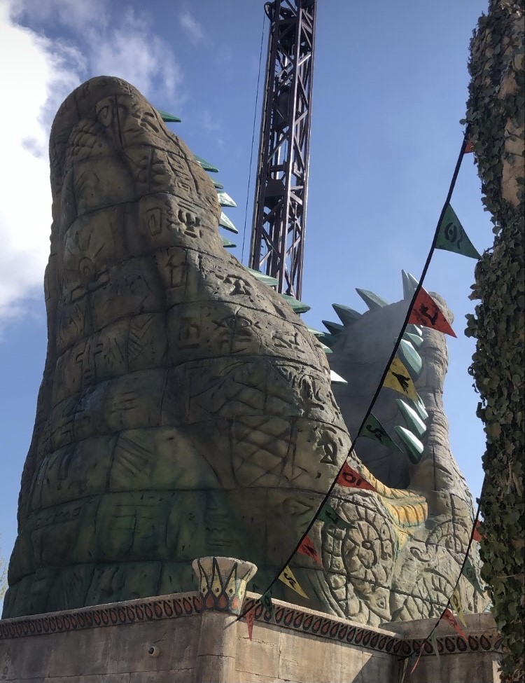
Face the monster that lay dormant for thousands of centuries only known as the foreboding Nemesis! Nemesis is the park's Bolliger and Mabillard steel inverted coaster. First opened in 1994, Nemesis has been roaring for almost 30 years! Designed by John Wardley, Nemesis was the second of its kind in the world after Batman the ride which opened at one of the Six Flags parks in the US. This beast of a Roller coaster is beloved by many and is regarded as quite possibly the best coaster in the UK. With its slue of inversions and high speed, the park claims it to be the most intense roller coaster in the world, so it's not uncommon for someone to black out for a short period of time when on the ride itself. One major element of the ride that makes it stand out from other  B and M inverts around the world is its layout. Due to Alton towers tree line restrictions, none of their rides are permitted to go above the tree line, so they had to get creative. Many B and M inverts heavily rely on height to help create a better, more intense ride experience, Nemesis however is instead built into a trench. Tons and tons of rock were blasted from the site in order to place the track down. This creates and incredible off ride view as the train dips and dives underneath bridges and has close encounters with the queue line and walkway, letting guests get the best view. Nothing beats the feeling of standing next to the track and hear that fantastic roar as the train thunders by. Another element of Nemesis is the large monster like structure that houses the station. According to the Nemesis lore, the monster you see is a creature from a dimension beyond our imagination. It lay dormant for centuries under the earth's surface, only until an excavation crew accidentally disturbed it and set it on a rampage. The only way they could prevent it from destroying everything is to hold it down with large pieces of metal, which you can probably guess is the track used for the ride. It would be quite an under statement to say that Nemesis was just a success, it was a HUGE success. It became famous around the world and even after almost 30 years, Nemesis is still regarded as an amazing coaster. It was so successful that Tussauds (the parent company that owned Alton towers and various other parks) opened a sister coaster called Nemesis Inferno at Thorpe park down in Surrey. Though the ride shares the same name, it really doesn't have much in common with the original Nemesis. After all these years Nemesis still keeps roaring!


Oblivion
Destination: Oblivion
Dive into the unknown on the world's first vertical drop roller coaster. Oblivion opened in 1998 and was once again designed by John Wardley and manufactured by Bolliger and Mabillard. Just like Nemesis, it didn't take long before this ride became world famous for being the world's first dive coaster, just like the name suggests, you dive down a vertical drop. When Oblivion opened, it launched a whole new area within the park, X-sector, themed to a sinister government facility which aims to test its machinery on people such as sending them into..... Oblivion. Unlike most modern dive coasters, Oblivion consists of one large drop and a bank turn into the station, because of this it's often called a one trick pony, despite this however, enthusiasts still love Oblivion for its incredible force when going down the vertical drop as many others of its kind often feel more weightless than intense. 

02 news: representation

1 which women are represented and how they are represented?  Women are under represented in the 1960s Observer which reflects a patriarchal ...